An exclusive gaming industry community targeted
to, and designed for Professionals, Businesses
and Students in the sectors and industries
of Gaming, New Media and the Web, all closely
related with it's Business and Industry.
A Rich content driven service including articles,
contributed discussion, news, reviews, networking, downloads,
and debate.
We strive to cater for cultural influencers,
technology decision makers, early adopters and business leaders in the gaming industry.
A medium to share your or contribute your ideas,
experiences, questions and point of view or network
with other colleagues here at iVirtua Community.
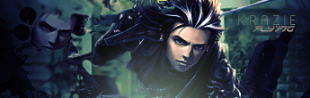
Like I said over MSN, it looks abit empty to me. You need to fill it up, but not with just effects. Create something that catches the attention of the viewer for a second or too, don't just add an effect. Also as I mentioned over MSN, the light seems abit misplaced to me, I believe it should be coming from above and not from below. The last thing is the text, you need to blend it in more. Don't just lower the opacity, apply some effects to it that makes it fit in.
As I said on MSN, overall it's ok, but it looks 'bit empty and I've seen alot better from you.